5 Mesh Banner Design Fails to Avoida
 14 February 2018
 3 mins read
Here at Mesh Direct, we’re passionate about mesh banner design and the artwork our customers send to print. Your banner represents you and your company, and so it needs to do your brand justice to your target audience.
That’s why we’ve put together these 5 mesh banner design fails to avoid when creating your artwork for grand format printing…
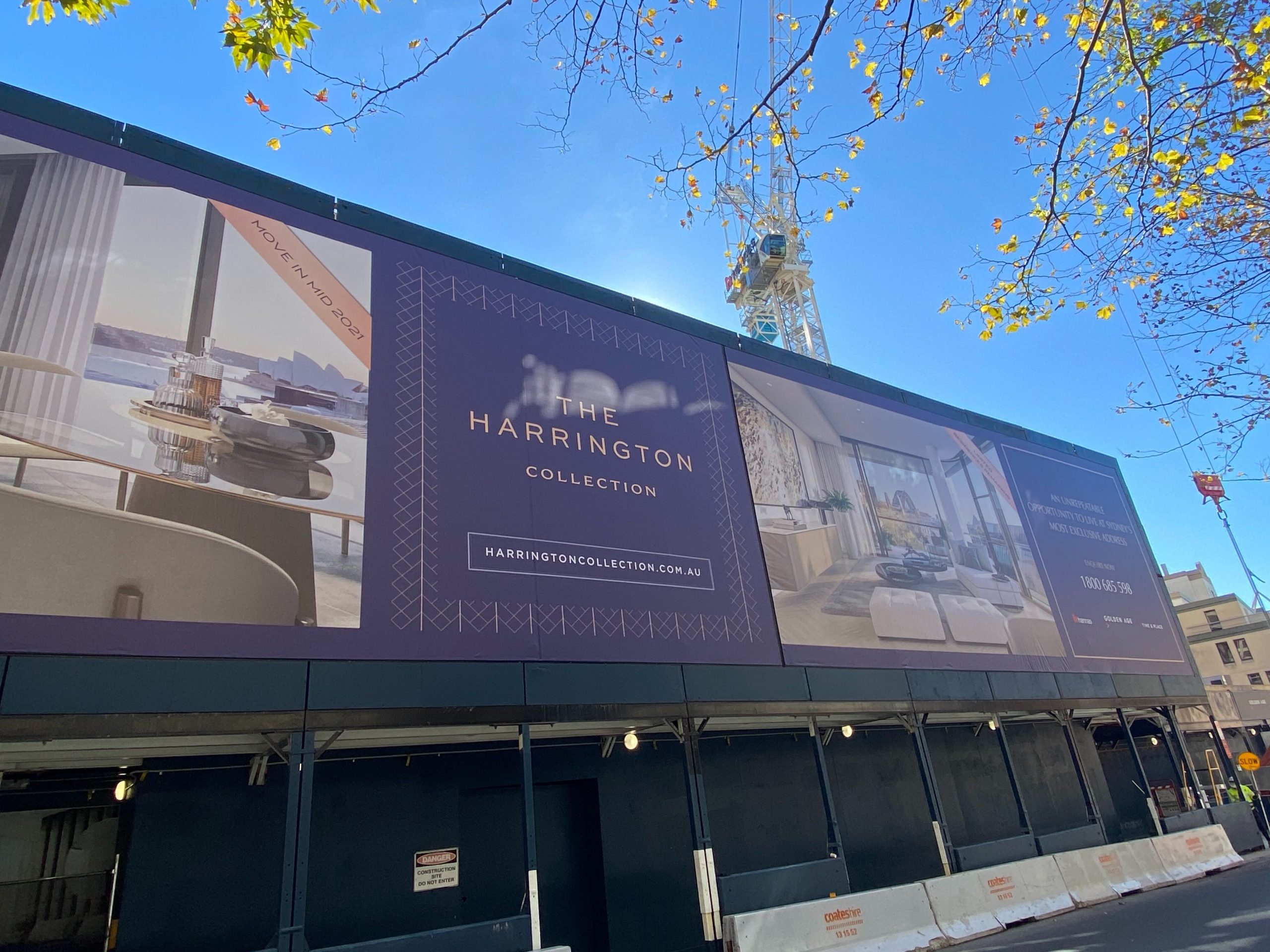
1. Using Complex Logos
Logos are part of your company’s first impression; how consumers will recognise and remember you.
Having a complex logo can be a huge mistake as it loses effectiveness and attention to detail, becoming a combination of shapes, colour and words that are difficult to interpret.
Keeping it simple is the best way; not having too many visual elements mingled will keep the consumer’s main focus right where it needs to be and for them to easily identify your company.
2. Forgetting to Proofread
You should spend as much time looking over your banner for errors as you do designing it.
Proofreading is crucial, as it’s pretty embarrassing when consumers pick up on incorrect grammar when the banner is being displayed; it makes you look unprofessional.
Using spellcheck is one way to avoid this, however, with certain words such as ‘their’ and ‘there’, spell check might not correct it. You want to maintain a professional standard, that’s why proofreading your own work and getting others to check it as well is so important.
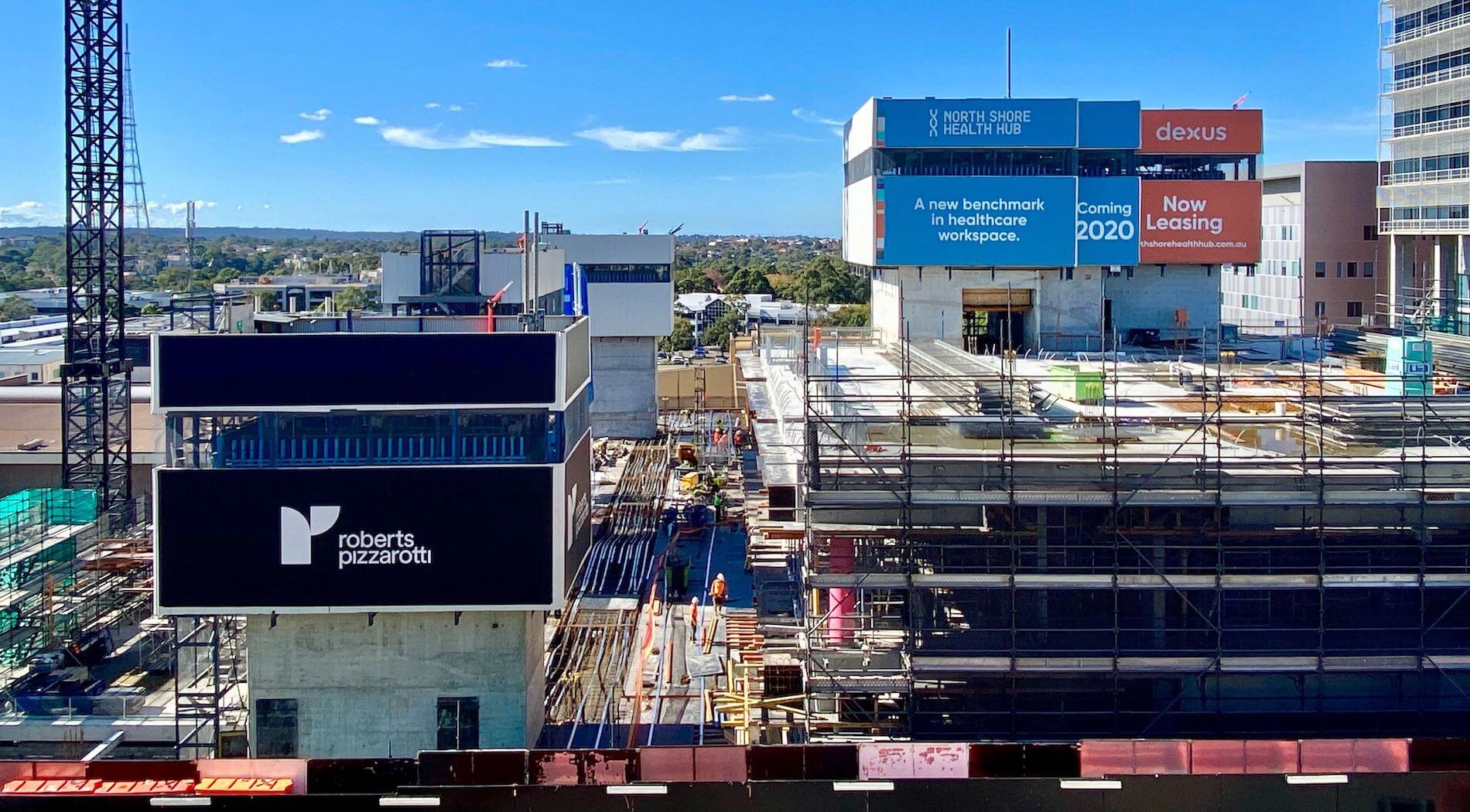
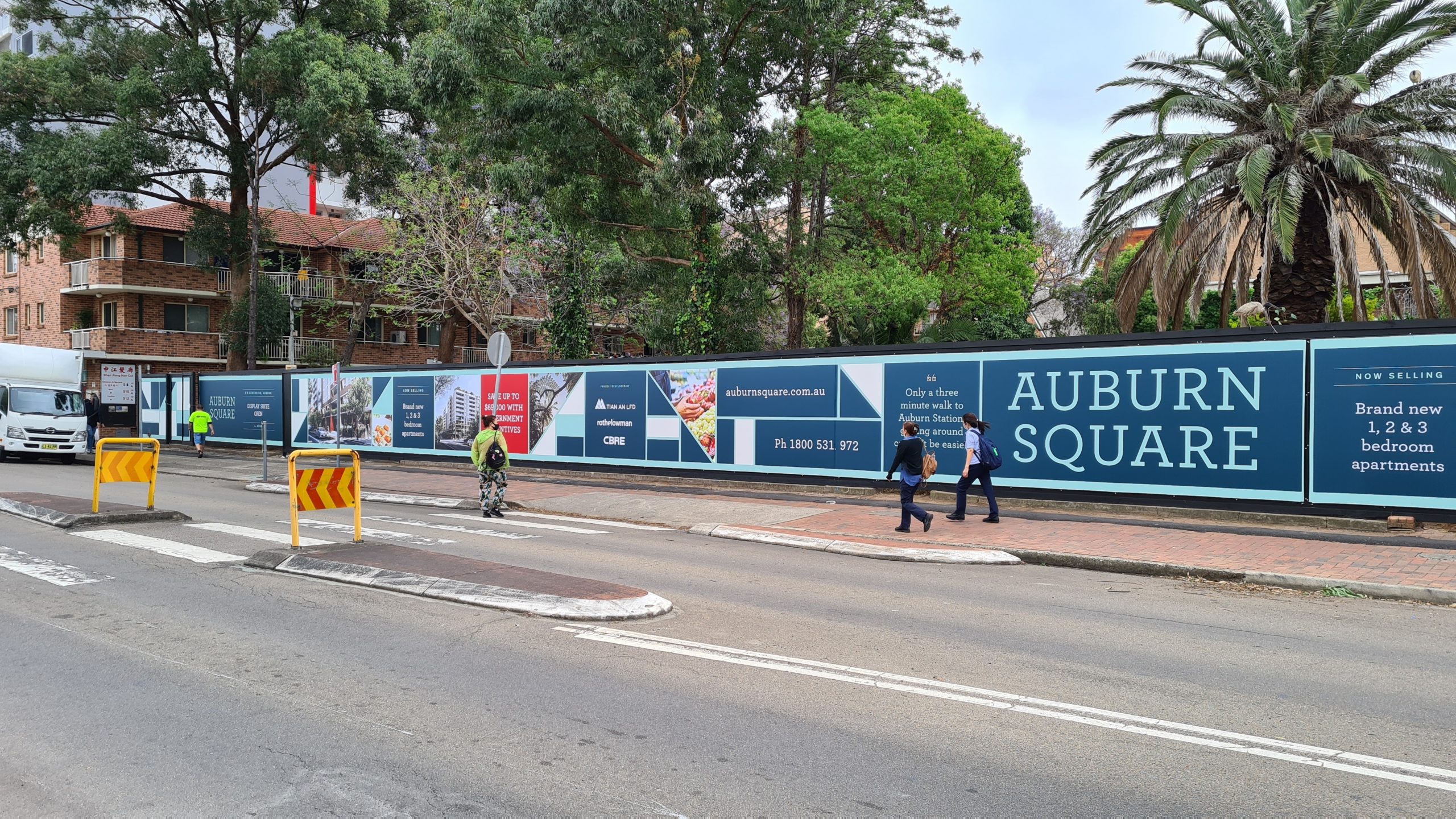
3. Not thinking about the banner placement
It’s imperative to display your banner where it will reach a maximum target audience.
Not going through the correct installation process, makes your banner look crinkly or too loose; to avoid this, you need to have significant tensioning across all poles.
Placing your banner away from your site or business or near other advertisements is not ideal, it does not give it the recognition your company deserves and makes your business look unpresentable.
4. Clashing colours
It doesn’t matter how outstanding your graphic design layout is, if the colour combination is not right, it will throw off your whole banner. Choosing an ambitious number of colours is a very risky move, it will drown your important information displayed and more than likely result in a colour clash.
These results have negative repercussions on your company by not getting any attention from consumers.
5. Overload of design
Attention to detail is a major demand when it comes to designing your banner. One mistake a lot of companies make is consuming their design space with an overload of colour, fonts and scattered navigation. These things make your company lose integrity and look tacky, which is not how you want to present your business. Some of these mistakes include:
- Drag and drop style layout
- Comic Sans
- Using a different colour for each letter- it gets annoying and is very distracting.
- A cluster of sentences- nothing some punctuation and paragraphs can’t fix.
- Scattered navigation- where the relevant information is not grouped together
***
And there you have it! 5 mesh banner design mistakes to avoid in order to ensure your signage is the best it can be.
If you’ve got questions about banner design, or would like to see how Mesh Direct can assist you with finding the right signage solution, click here or give us a call on 1300 368 978.