Scrim Banners are the perfect cost-effective signage solution for construction sites of any size that need protection and visibility, and work wonders for promoting your brand.
Of course, it only works as an effective advertising tool if people notice it. So how can you make your Scrim Banner really stand out?
This blog article will provide insight into what Scrim Banners are, how to use them, and how to design high-impact Scrim Banners that will make your dreams come true. Let’s dive in!
What Is a Scrim Banner?
Scrim Banners are a form of mesh banner that are particularly budget-friendly for projects that require large runs of material.
They’re our go-to signage option for large runs of cloth, because they can be installed almost anywhere without applying pressure to the attached structure while still letting large wind loads pass through. They’re designed with an open-weave to allow for heavy winds, so are great for outdoor purposes.
The benefits don’t stop there – scrim banners are also a wonderful medium to use for printing your company logo and designs. Our scrim is made at 70% density to ensure your colour quality and font clarity is as great as possible for the purpose, and we use UV stabilised inks to keep it that way for at least 12 months (no matter what the Australian weather decides to throw at it!). For this reason, they’re more suitable for short to mid-term projects that require cost-effective solutions. Keeping your banner mesh fresh is the easiest way to extend its life.
Scrim Banners are required to meet Australian building laws and standards. All Mesh Direct products fit the bill and are printed in Australia for superfast nationwide turnaround times. Don’t worry, we got you.
How to Use a Scrim Banner
Scrim Banners can be used for a very diverse range of projects in all industries.
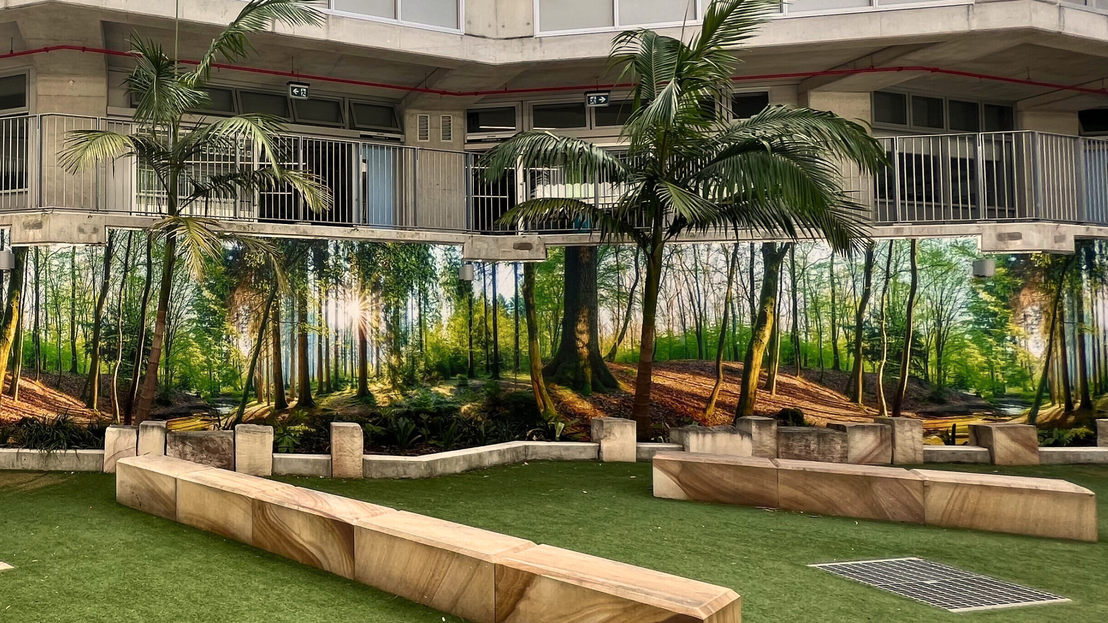
We’ve worked with clients who’ve used them for construction and development sites, scaffold branding, events, festivals, retail sites, community and school projects, and government and infrastructure projects. Talk about an all-rounder!

Practical Scrim Banner
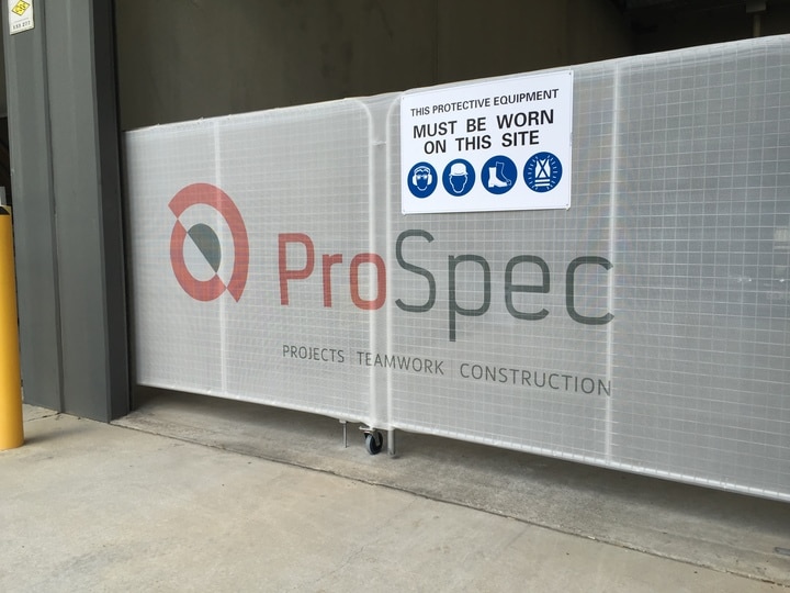
If you’re after a more practical solution, Scrim Banners are perfect for concealing construction or renovation projects from passersby and will help block dust from escaping your site, keep it looking neat and professional.
Even if you’re only really using it for practical reasons, your Scrim will still serve as advertisement for your brand or project. How could it not when it takes up that much space?! Take advantage of it with high impact design.
Advertisement Scrim Banner
If you’re after an advertisement-focused banner, Scrim is perfect for covering large areas and being the most noticeable thing in sight. It’s built for indoor and outdoor purposes and is flame retardant, which means the options are truly endless.
Promote your logo to increase brand awareness while on the job, generate excitement for current or upcoming events, or promote your project while keeping your site looking schmick.
Different Lengths & Installation Processes
Mesh Direct Scrim Banners are available in lengths of 50m rolls and made from 180gsm knitted monofilament polythene. Like most mesh banners, they are attached to fencing, scaffolding or building facades using eyelets at the top and bottom of the scrim.
This is certainly easier said than done, so we offer an Installation Service that lets you leave the hassle to us. Mesh Direct experts can help you properly fix your signage with the perfect tension to get the best-looking, longest-lasting result.

How to Design High Impact Scrim Banners
Designing an eye-catching Scrim is in your best interest. It promotes your brand to all passersby and is therefore a direct reflection on your abilities, product, or service. You wouldn’t wear pyjamas to an important meeting, and so you shouldn’t install poorly-designed Scrim on your important project or site. Your reputation matters.
There are design best-practices to keep in mind if you want to achieve the maximum result. How you use colour, font, design, graphics, and your logo are important choices that will affect how impactful your scrim is.
Here are our top three tips for high-impact scrim banner design:
Simple is Best
Know your purpose and use this to inform your design. Your purpose should be immediate.
The simpler the better. Depending on where your Scrim is, it’ll mainly be seen by passerby who don’t have time to stop and read it. More likely, they’ll be whizzing past in cars, trains, bikes, or buses and can only digest a small amount of information in a short amount of time.
It’s always best to know exactly where your banner will be installed before designing, so you can account for the height and distance it’ll be viewed from. If you find yourself running out of space to include a logo or high-quality images, you’re probably packing too much in.
Keep your text concise and readable from a distance. Ensure your text is large enough and your font isn’t too stylised so it’s easy to make out, but that it still clearly aligns with your branding. Don’t get too carried away. Keep it simple.
Make it Pop
Because your Scrim is mainly seen by passersby on the go, you need to stand out to generate impact. You can do this by using an obvious focal point, white space, colour, and engaging high-quality imagery.
The focal point of your banner should be the one primary message you’d like passersby to notice, such as your logo or the name of your project. To create a focal point you need to naturally draw eyes to that point of the banner. You can achieve this using contrast or enlarging size. The focal point is important for quickly grabbing attention that then encourages viewers to take a closer look at the smaller details in your banner.
Utilising white space is a great way to make your focal point and overall banner pop. White space is the use of negative space between design elements to portray a message or emphasise those design elements. Moral of the story: don’t be afraid to keep it simple.
Colour is perhaps the most important element in making your banner stand out from the crowd – studies have found up to 90 percent of people’s first advertisement impressions are based solely on colour. We recommend knowing the surface and area your Scrim will be installed in to inform your colour choice, because installing a brown banner on a brown wall isn’t the most eye-catching form of advertisement. Use contrasting colours that demand attention and align with your branding.
Use High Quality Images
Because there’s nothing worse than a grainy, blurry image. We highly recommend using personalised images or logos on your Scrim to achieve maximum impact, but also insist you use high-quality files to ensure your finished product is clean and sharp.
When you’re looking at an image or logo file on a computer screen, it can be hard to tell what it’ll look like when it’s blown up on a large-scale banner. Using poor-quality images on banners is one of the most common mistakes.
There are plenty of rules to follow – provide logos as Vector files, convert them to CMYK, and use images at a minimum of 300ppi. This can be super overwhelming, so we recommend following our Quality Artwork Guidelines. In this resource-hub we have step-by-step instructions, video tutorials, artwork templates, and size guides to help you achieve a high-quality, high-impact Scrim Banner. Explore our blog for other helpful resources on checking and changing image resolution.
Ready to Design Your Scrim?
Explore our extensive blog for banner design inspiration to get your creative juices flowing. Mesh Direct is Australia’s leader in grand format printing and out-of-home advertising, and we’re always available and excited to discuss your next project.


