In the world of advertising and marketing, making visually appealing materials is crucial. When it comes to construction and fencing projects, banner mesh ads can be an effective way to get your brand noticed. As we step into 2023, it’s the perfect time to implement fresh and bold marketing materials that can help you stand out from the competition.
In this post, we will share tips and tricks for producing eye-catching designs for mesh banners, also known as a scrim. We will cover the printing process, essential design elements, font choice, image and graphics best practices, making cohesive designs, and common mistakes to avoid when designing effective banner mesh ads.
Understanding the Banner Mesh Printing Process
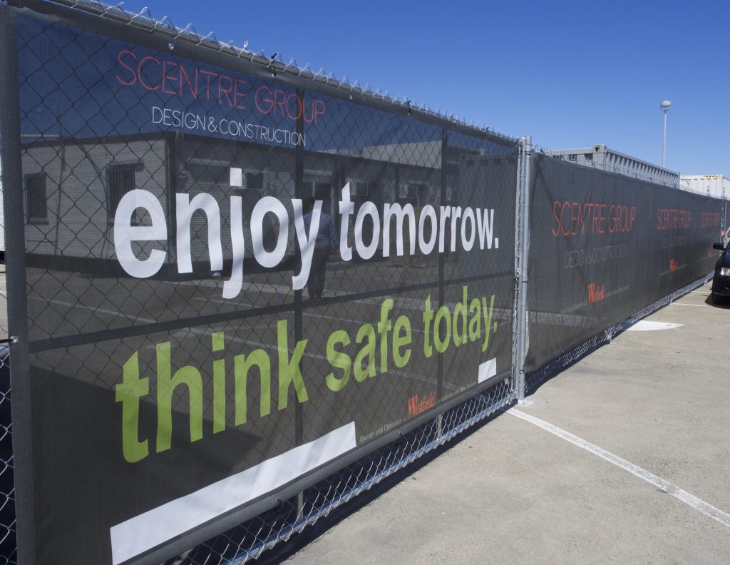
Mesh banner printing is a process that involves printing on lightweight and transparent materials that are ideal for outdoor advertising in construction sites, fencing, and other large-scale projects. The printing process involves the use of high-quality materials and ink to ensure the longevity and readability of the banner mesh ads. Scrim, a variety of mesh banners, is highly durable and can withstand harsh weather conditions. Mesh banner printing is a cost-effective way to promote your brand or product and reach a wider audience.
Mesh Banner Printing Process
The mesh banner printing process involves several steps to produce a high-quality banner. First, the layout is created using software like Adobe Illustrator or Photoshop. Once the layout is ready, it is printed onto a roll of mesh banner material. The printer uses specialized inks that are resistant to fading and harsh weather conditions. After printing, the banner is trimmed to size and eyelets are added for easy installation. The final product is a durable, high-quality banner that is perfect for outdoor advertising.
Key Design Elements for Banner Mesh Ads
Designing a successful banner requires attention to certain essential elements that will help your brand stand out. These elements include your brand colours, logos, and any critical details that represent your brand. When incorporated into your design, they can help achieve an effective and visually appealing banner ad. You should also consider the materials and construction of the banner, as well as its placement on site. Additionally, the message on the banner should be clear, concise, and easy to understand, as it will be viewed by your customers and potential customers alike. By carefully considering these factors, you can create a banner that stands out, effectively communicates your message, and leaves a lasting impression on your audience.
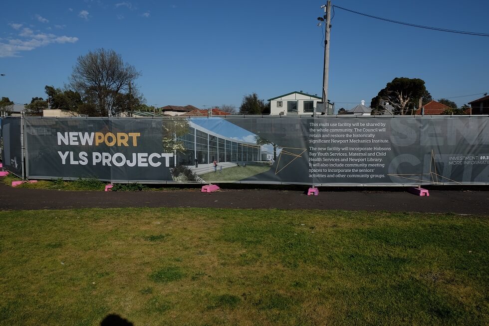
Choosing Fonts and Prioritising Readability
Choosing the right font is critical to creating a successful banner mesh ad. The font must be easy to read from a distance and visually appealing. When selecting a font, it’s essential to choose a font that is bold and legible. Sans serif fonts like Arial and Helvetica are popular choices for banner mesh ads. It is also crucial to ensure that the font colour contrasts with the background colour of the scrim to improve readability.
Best Practices for Incorporating Images and Graphics
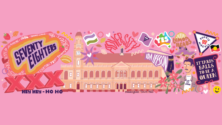
Images, artwork, and graphics are an effective way to grab attention in a banner mesh ad. It’s essential to ensure that these images are of high quality and are clearly visible from a distance. To achieve this, the images or artwork should be high-resolution and have bright colours to ensure that they can be seen from a distance. It’s also important to use images that are relevant to the message being conveyed. Check out our artwork specification page to give yourself a clearer idea of what sort of imagery you’ll be applying to your banners.
When it comes to details, intricate artwork may not be best represented on some types of banners. We can provide some example print prototypes if you’d like to compare banners we stock, however, most customers prefer to use a vinyl banner or high-density banner type when advertising artwork or images that are designed to show off intricacies. You can check out some great examples in our case studies gallery to see what we mean!
Creating a Cohesive and Visually Appealing Design
Designing a visually appealing banner mesh ad can be challenging. One key aspect is creating a cohesive layout by balancing visual elements and incorporating whitespace. A well-designed banner ad should also have a clear and concise message that is easy to understand. This can be achieved through the effective use of typography and imagery.
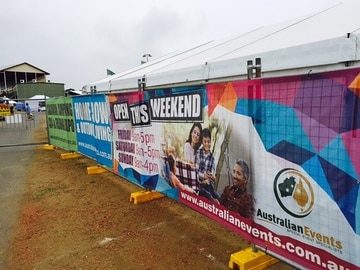
In addition, attention-grabbing features such as bold colours and large text can help the banner stand out from its surroundings. Keep in mind that eyelets are used to attach your banner to a fence or building, so incorporating this into your layout considerations is a must.
When it comes to materials, choosing the right type of mesh and print quality is important for both durability and visual impact. Reusing banner mesh is also a sustainable option that can help reduce waste.
Remember that it’s important to consider the target audience and their needs when designing a banner ad. By keeping in mind the specific market and tailoring the message and composition to suit them, the banner is more likely to have a meaningful impact.
Common Mistakes to Avoid When Designing Banner Mesh Ads
The most common mistakes made when designing scrim or banner ads include using too much text, low-quality images, and poor font choice. It’s essential to avoid these mistakes to create effective and visually appealing scrim ads. Instead, the layout should be simple and easy to read. The font should be legible and bold, and the images should be of high quality and relevant to the message being conveyed. By avoiding these common mistakes, you can create a high-quality banner mesh ad that effectively promotes your brand or product.
Making an effective banner mesh ad is a significant investment for any business. Understanding the printing process, incorporating essential design elements, choosing the right font, incorporating images and graphics, producing a cohesive design, and avoiding common mistakes are all critical to implementing an eye-catching scrim ad.
At Mesh Direct, we specialise in the supply, manufacturing and delivery of quality mesh banners, ensuring that your project or business stands out. Contact us today to facilitate your project and achieve your marketing goals.

