The Five Best Outdoor Advertising Campaigns of All Time (so far)
 30 January 2020
 3 mins read
Effective visual advertising can be a unique artistic experience for both designers and viewers. Outdoors advertising campaigns which make us laugh, smile or think are the ones that stay with us throughout the day. They’re the ones we talk about with friends and share on social media. They’re the ones that change how we perceive the space around us. They subconsciously make their products stand out in our minds, without us necessarily even being aware of it.
What gives an advertising campaign that ‘it’ factor? Is it the colours, or the use of space? The product? The tagline? Probably a judicious combination of all of the above – a singular coming-together of aesthetic factors that happen to collide in that perfect combination.
Whatever it is, these campaigns had it! Design, authorship and product came together in these five outdoors advertising campaigns to create memorable and arresting marketing which we’re all a little envious of.
McDonald’s
This advertising giant has been around for a long time, but they’re not slacking when it comes to creativity and innovation in their campaigns.
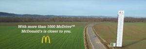
In France, they took advantage of the fact that they have many more drive-throughs (called McDrives) than Burger King. They placed one massively over-sized billboard with a series of complicated directions to the closest Burger King drive-through, next to a small sign with an arrow pointing to the McDonald’s drive-through.
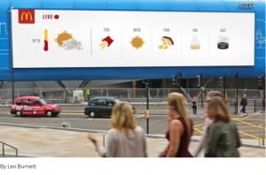
In the UK, they played the unpredictable weather to their advantage. Their billboards, for all intents and purposes a weather prediction board, mimicked weather icons with McDonald’s foods.
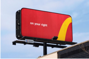
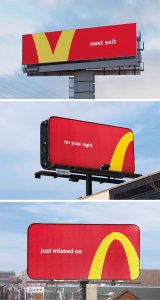
Their iconic ‘Follow the Arches’ campaign in Toronto transformed the deconstructed logo into minimal direction boards to the nearest restaurant. It’s always brave to mess with such an established logo, but the bold step paid off!
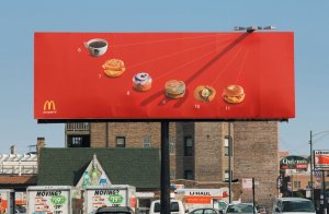
The ‘What Time is It’ campaign was similarly inspired. Billboards doubled as sundials, which at each hour pointed to a McDonald’s food.
Delta and Tinder
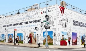
Delta’s Dating Wall, in New York, is difficult to beat when it comes to clueing into current social trends. The giant mural features Delta’s logo and life-size backdrops of famed locations around the world, with the slogan ‘World Travellers Are More Likely to be Swiped Right.’ Passers-by are encouraged to take selfie’s against the backdrops and use them in their tinder profiles!
Powerade
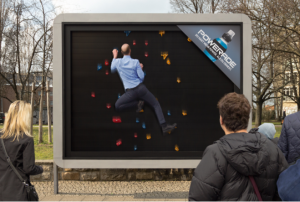
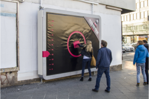
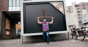
Although it might be considered outdated by now, their campaign from 2015 featuring interactive billboards is still a winner. The ‘You Have More Power than you Think’ slogan was accompanied by climbing walls, weight bars and boxing pads on the billboards, engaging passers-by to perform the behaviour that Powerade was encouraging.
IKEA
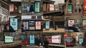
With the opening of their Greenwich store, the most sustainable IKEA store yet, the established company plastered London with walking and public transport directions to the store. A large arrow with the number of steps required is all that these visually arresting ads featured.
Spotify
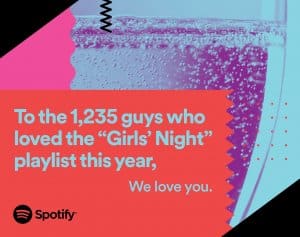
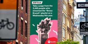
Their 2016 ‘Thanks 2016, it’s Been Weird’ campaign is still remembered today. The brand’s characteristic geometric shapes and block colours were superimposed by the most fascinating music statistics of the year, accompanied by humorous quips. My favourite was the person who listened to ‘Sorry’ 42 times on Valentines Day, to whom Spotify asked: what did you do?
