Tips to create compelling retail signage
 24 August 2019
 2 mins read
Signage is usually pretty essential for retail outlets. It serves an important purpose, from helping customers find the store to displaying important information and pointing them in the right direction for merchandise. We’ve had the pleasure of working with many big retailers over the years and we know a thing or two about creating great retail signage. Mesh Direct‘s in-house design team have put together these top tips to help you to create compelling signage for your store.
Be concise
The attention span of a customer is usually short. Retailers must remember that customers are often in a hurry. Therefore, it is important to get your message across quickly and simply.
Easy to read fonts
Make sure you use easy to read fonts. While some retailers might opt for the old-fashioned chalk on a chalkboard, it doesn’t mean that this approach is really driving sales. Choose clear font characters without curly-cues. If customers can’t quickly read it, they’ll move on.
Choose your words
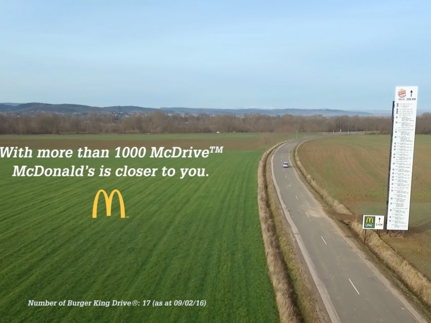
Consider including words such as “you” and “yours” in the text of your signage. This makes it more relatable for customers and the sign becomes more persuasive. We recommend using short sentences. Avoid dull and boring retail signage. Unexciting signs will not attract buyers.
Have fun
Think outside of the box. If you create something different it’s likely to grab shoppers attention. Also, it’s more likely to stand out in their minds in the future.
If you need more advice about your signage, get in touch with our team. We have a dedicated in-house design team can advise and guide you through creating compelling retail signage.
Get in contact with us by clicking here.
