Navigating a large or unfamiliar environment like a hospital, airport, or bustling shopping centre – can be confusing for visitors. At Mesh Direct, we know that clear and effective wayfinding signage can make all the difference. It not only enhances the visitor experience but also improves safety and accessibility. In this guide, we’ll take you through the essentials of wayfinding, covering everything you need to know to implement effective signage for you and your visitors‘ needs.
What is Wayfinding Design?
Wayfinding design is all about helping people navigate through complex spaces using visual cues such as directional signs, maps, and symbols. The wayfinding definition doesn’t just include signage but also elements like architecture, landscaping, and art. Think of it as elements that contribute to user navigation and orientation in different environments. It’s more than just placing signs; it’s about creating a cohesive wayfinding system that considers the entire environment, from building entrances to exits. Effective wayfinding signage ensures that visitors can move through spaces with confidence and ease, reducing stress and enhancing safety.
At Mesh Direct, we specialise in crafting wayfinding signs that are functional, accessible, and designed to fit your brand’s aesthetics. Let’s dive into the key components of this type of signageand explore best practices for wayfinding design.
What are The Rules of Wayfinding Design
Creating effective wayfinding signage involves following 5 essential rules to ensure clarity, consistency, accessibility, and durability. Here are some fundamental principles to help design wayfinding signage that works in any environment.
1. Prioritise Clarity and Simplicity
Clarity is the most crucial aspect of wayfinding signs. Information on directional signage should be straightforward, with minimal text, high-contrast colours, and legible fonts so it’s instantly readable. For instance, exit signs or restroom symbols should be recognisable at a glance. This is especially important in high-traffic areas where people are moving quickly. Keeping messages concise and using universally understood symbols helps create effective wayfinding signage, guiding visitors effortlessly through a space.
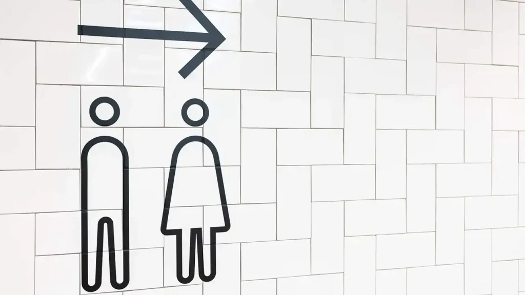
Quick Tip: Position directional signage at eye level and ensure good lighting to make signage visible from a distance. This maximises clarity and allows visitors to easily locate their next steps.
2. Ensure Durability and Weather Resistance
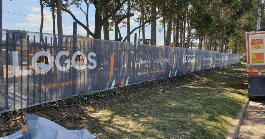
In outdoor settings, wayfinding signage must be able to withstand harsh environmental conditions. Durable materials and weather-resistant qualities are essential for directional signage exposed to sunlight, rain, or wind. For example, outdoor events, festivals, and retail spaces benefit from signage that remains intact and legible in varied climates. In Australia’s diverse weather conditions, wayfinding systems need to be reliable year-round. Opt for signage designed with high-quality prints and durable finishes that won’t fade or degrade over time.
Consider This: Select wayfinding signs that are suitable for high winds and intense sunlight, ensuring they remain clear and legible. These materials make the signage a long-term investment, even in complex environments with frequent changes in weather.
3. Maintain Consistent Visual Cues
Consistency across all wayfinding signage creates a cohesive look that visitors can easily recognise. This means using a uniform design approach in terms of colour, font, and style for all different signage. By maintaining consistency, visitors can quickly identify key information and navigate with confidence. Whether in a retail setting or a public building, a consistent branding or visual theme reassures visitors that they’re following a logical path to their destination.

Consistency in Design: Ensure colours, symbols, and language are cohesive across the entire wayfinding system. This makes it easy for users to recognise important messages and enhances the overall flow of traffic in a given area.
4. Consider Environmental Suitability and Traffic Flow
In outdoor or high-traffic environments, wayfinding signage needs to be strategically placed to guide foot traffic efficiently. Think about the landscape design and how directional signs can direct people through defined paths without causing congestion. Signage placed at key junctions and major entry points like building entrances or emergency exits should allow smooth traffic flow by providing clear directions.
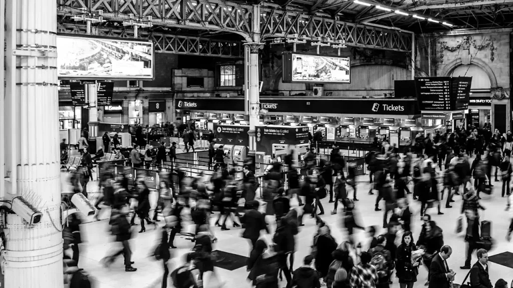
Design Tip: Incorporate landmarks or familiar reference points into your wayfinding strategy to help visitors orient themselves and feel more comfortable navigating unfamiliar spaces.
5. Ensure Accessibility and Inclusivity
An inclusive wayfinding system should consider the needs of all users, including those with disabilities. To maximise accessibility, you can use high-contrast colours, large fonts, and easily recognisable symbols for wayfinding signs. Positioning signage at various heights can accommodate individuals in wheelchairs and other mobility aids. Also, consider adding Braille or tactile elements to key signage areas to improve accessibility.

Pro Tip: Accessibility isn’t just a good design practice; it’s essential for compliance with safety standards and regulations, particularly for regulatory signage like exit signs and evacuation routes.
What are the 4 types of wayfinding signage?
Four types of wayfinding signage are directional, identification, informational, and regulatory. A successful system of wayfinding will include these types of signage, each with its specific function. Here’s a breakdown of how the four different types of wayfinding signage can be used to guide people effectively:
Directional Signage
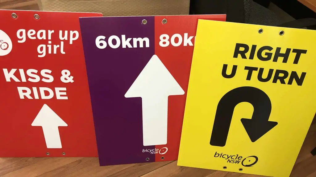
Directional signage provides guidance from one location to another using arrows, symbols, or maps. These are ideal for high-traffic areas where clear directions are essential, such as festivals or trade fairs.
Identification Signage
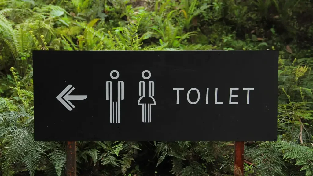
This type of wayfinding signage helps people identify key locations, such as entrances, exits, and specific facilities. By marking critical points of interest, identification signage ensures visitors can confirm their current location and reach their destination efficiently.
Informational Signage

Informational signage provides essential details, such as operating hours, facility rules, or available amenities. In events or retail environments, informational signs can direct people to restrooms, information desks, or other amenities.
Regulatory Signage
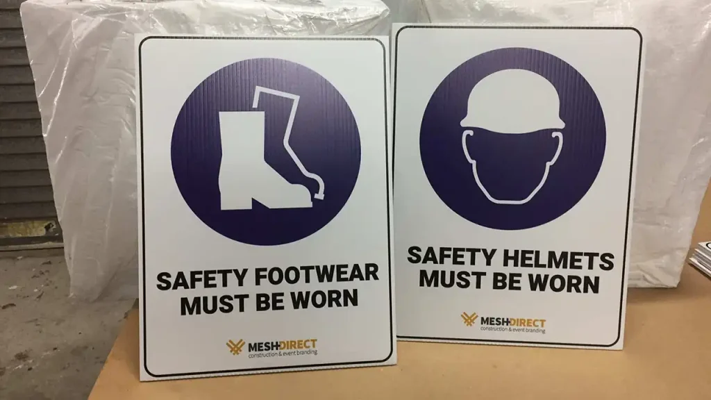
Regulatory signs communicate safety information, rules, and restrictions to ensure compliance and visitor safety. From emergency exits to high-risk areas, regulatory signage is essential for safety in public spaces. Useful wayfinding systems not only enhance safety in emergencies but also promote discoverability of key areas, improve navigation for unfamiliar visitors, and contribute to an overall positive experience through clear and accessible signage.
Where to Use Wayfinding Signage
Wayfinding signage is an important aspect of most public spaces, making it ideal for a range of applications across different industries:
Events and Festivals
In large event settings, clear directional signage and identification signage are essential to guide attendees smoothly through the venue.
Retail Environments
Shopping centres and department stores benefit from informational signage that directs customers to amenities like restrooms and elevators.
Trade Fairs and Real Estate
Trade fairs and real estate properties can be overwhelming to navigate without a clear wayfinding system. By using customisable signage from Mesh Direct, you can provide a welcoming and professional look while making the space easier to navigate.
Make Navigation Simple with Mesh Direct
At Mesh Direct, we understand that wayfinding signage isn’t just about pointing people in the right direction – it’s about enhancing the user experience, ensuring safety, and creating a more welcoming space. Our wayfinding signs are crafted with attention to quality, durability, and environmental responsibility, making them the perfect choice for any setting.
Whether you’re outfitting a festival, retail store, or commercial space, Mesh Direct can help you create a wayfinding system that supports seamless navigation and enhances visitor experience. For expertly designed wayfinding signage that combines functionality with quality, explore our wayfinding products or contact our team today for a quote.


