What is Pantone and the Pantone Matching System (PMS)?
 23 December 2020
 3 mins read
What is Pantone?
First off I think it’s best to briefly describe to you what Pantone is. Pantone (meaning “all colours”) is a universal language of colour, more than 10 million designers and producers rely on the Pantone colour system worldwide, it’s a way in which two companies or individuals from opposite sides of the world can communicate and understand what is expected from each other as far as colour and finishes go. Colours and finishes are given numbers to which they are allocated making it a very good system for those around the world that do not share the same language.

Pantone Matching System (PMS)
Now that we have a basic understanding of the Pantone colour system it’s time to dig a bit deeper into looking at types of colour systems they have.
There are two different types of colour systems with Pantone. The Pantone Matching System (PMS) and Pantone Fashion, Homes + Interiors (FHI) system. Today we are looking at the first of the two.
The Pantone Matching System (PMS) is the colour standardisation system that assists in colour matching and identification. It consists of 1,867 solid colours created by combining 13 base pigments. The majority of the colours for graphics are assigned a three or four-digit identification number followed by the letters U, C, or M. These letters represent paper stocks “uncoated”, “coated”, or “matte”, respectively.

PMS vs. CMYK
CMYK is an acronym you’ve probably heard of before in the printing industry and it stands for Cyan, Magenta, Yellow and Black, named after the four plates used to print out desired colours. Using CMYK is fine for your printer at home and often perfectly fine for other big commercial applications, the issue comes from it not being consistent 100% of the time. Depending on the calibration of the printer the colour using CMYK may come out a little different each time, whereas using the Pantone Matching System this wouldn’t be an issue. For a single item being printed the inconsistency won’t matter as much but say printing hundreds or even thousands of duplicates “close enough” will not cut it. It’s safe to say that Pantone printing is best for large projects with consistent, pure colours while CMYK printing is better for a mixture of different printing jobs that don’t require 100% accuracy all of the time.

Invented in the early 1960s the Pantone matching system has completely changed the game when it comes to consistency of colour and knowing you are getting your desired tone each and every time. Even though CMYK has its place, Pantone for decades now has been the go-to for knowing exactly what you’re getting. Hopefully, you’ve learnt just a bit about Pantone and their colour system and how it can help you next time you’re after an exact colour match for your prints.
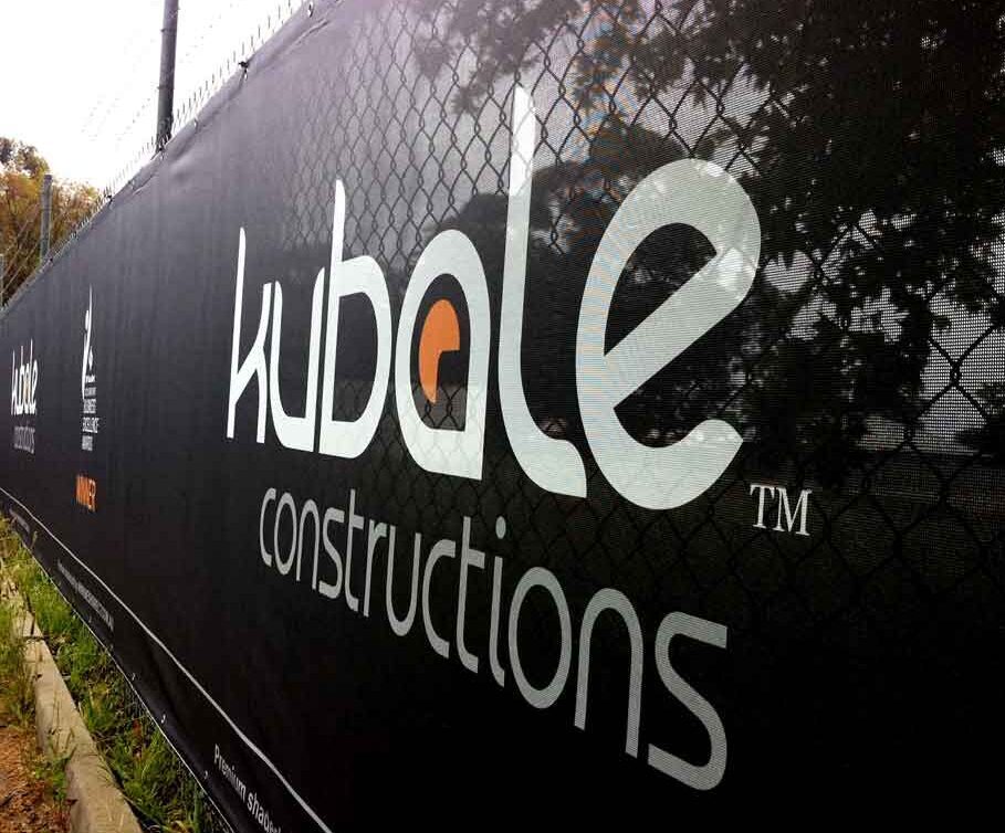
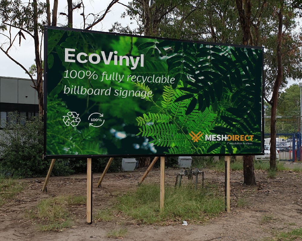
To read about some of Mesh Directs projects that required colour matching, have a look here. View some of our latest projects here that showcase excellent print reproduction and design.