If you’re working in print and digital design, then it’s crucial that you understand the different colour modes involved. Professional graphic designer’s and novice’s alike should be aware that the right colour mode will allow for accurate colour reproduction whilst maintaining the integrity of your designs. Whether they’re viewed on-screen or printed, the right range of colours will make all the difference!
This blog will break down all the notable differences between the three main colour modes. Here we will explain what RGB, CMYK, and Pantone colours are, and where you should use each one to get the best results.
RGB: The Colour Mode for Digital Designs
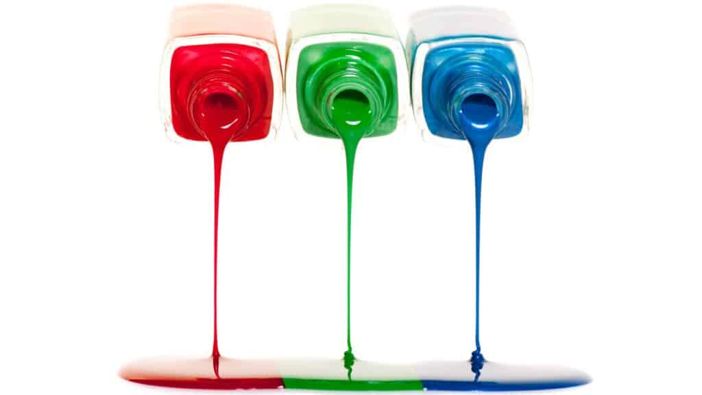
Red, Green and Blue make up the RGB colour mode. These are the primary colours used in digital devices like computer monitors, digital cameras, and smartphones. In this additive colour model, different combinations of red, green, and blue light are mixed together in varying intensities. This creates a broad range of colours for a digital screen.
These colours create white light when combined at their maximum intensity. On the other hand, the absence of these colours will produce black. This model is ideal for digital designs, because RGB colours are displayed using light rather than physical pigments or inks.
When should RGB be used?
To know when to use RGB, think about where the content is going. RGB colours are created by combining red, green, and blue light, making them ideal for digital displays. They’re best suited for:
- Digital images displayed on websites, social media, and digital marketing platforms.
- Digital devices like televisions, monitors, and cameras.
- Projects that will be viewed exclusively on-screen.
To ensure accurate colour representation, screen calibration is essential when working with RGB colours on digital displays.
CMYK: The Colour Mode for Print Design
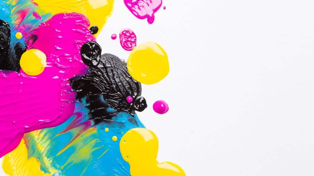
CMYK stands for Cyan, Magenta, Yellow, and Black (K). It’s often referred to as “The subtractive colour model”, and unlike RGB which uses light to create colours, CMYK relies on ink colours that absorb light.
In CMYK mode, four colours are combined to create the colours we see on printed materials. These CMYK colours are usually physically applied during the printing process, with the more colours you mix together, the darker the resulting colour becomes. High print resolution is crucial for achieving sharp and clear printed materials in CMYK mode.
For example, mixing cyan, magenta, and yellow creates black. However, true black ink is needed to enhance depth and detail in printed designs. This is why the “K” for black was added to the CMYK model, helping maintain sharp edges and avoid colour shifts in dark areas of an image.
When would you use CMYK?
Consider using the CMYK mode for any colour printing you might do. This will make sure that the colours in your design are accurately reproduced on paper. CMYK is best suited for:
- Printed materials, such as signage, banners, brochures, posters, and magazines.
- Print media like packaging and business cards.
- Projects that will be professionally printed using CMYK printers.
Comparing RGB vs CYMK
Understanding the difference between RGB vs CMYK is critical when deciding which colour mode to use for your project. Here’s a summary of the key differences between them:
- RGB (Red, Green, Blue): Used for digital designs and screen-based projects. It’s an additive colour model that uses light to create vibrant colours.
- CMYK (Cyan, Magenta, Yellow, Black): Used for print design and printed materials. It’s a subtractive colour model that uses ink colours to absorb light and create colours.
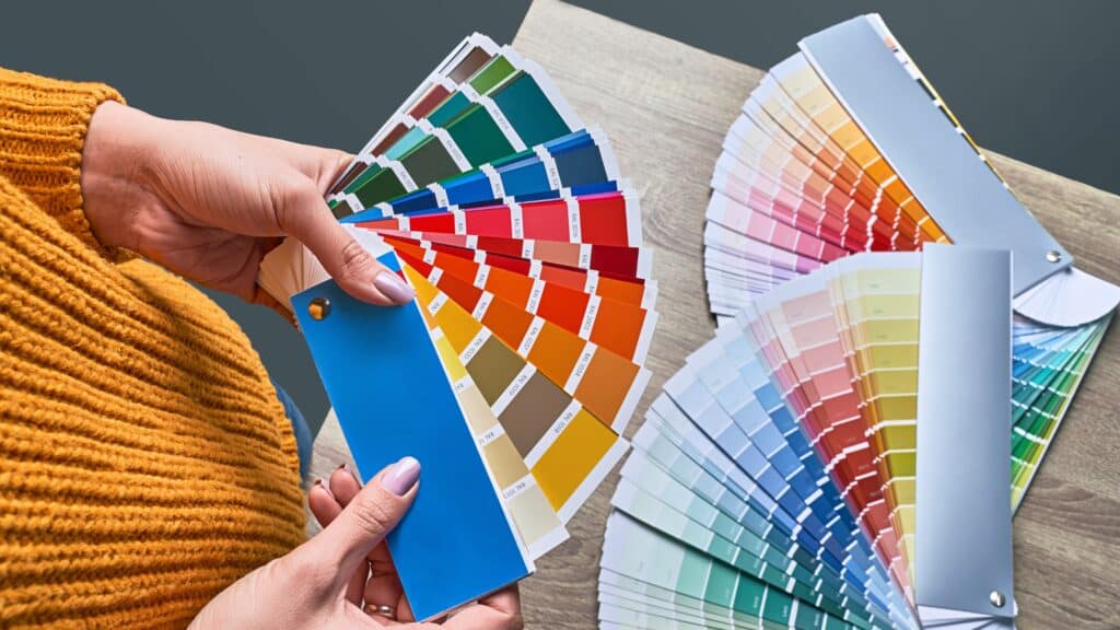
The choice between CMYK vs RGB will always depend entirely on the type of project you’re doing. Each colour mode uses a different profile to define how colours are interpreted and displayed. Making the right decision is essential for accurate colour reproduction, as it will ensure that your designs appear as they were intended – whether viewed on-screen or in print. For a useful guide on artwork specifications – Click here.
Is it better to print in RGB or CMYK?While RGB is perfect for digital applications, the CMYK colour modes are the go-to for print projects. If you’re working on a digital project, the RGB colour model is the best option. If you’re preparing artwork for print, CMYK mode will help ensure your colours translate correctly onto paper or mesh!.Ensuring colour accuracy is essential for achieving the desired results in print projects.What do Pantone colours mean?Pantone: The Colour Mode for Precise Colour MatchingPantone colour is a colour matching system used to ensure consistency across designs. It differs from RGB and CMYK because it uses a standardised set of colours for precise matching. The Pantone Matching System (PMS) assigns specific codes to thousands of colours, ensuring that the exact same shade is reproduced, no matter where or how it’s printed.Pantone ensures that the same colours are reproduced consistently, regardless of the printing medium. This is particularly useful when a brand needs to maintain colour accuracy across multiple printing processes, such as when printing a logo on both glossy magazines and matte packaging.
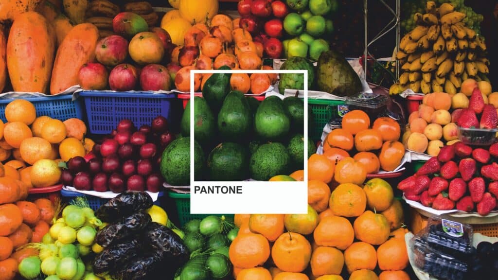
Below are some examples of what Pantone colour is best suited for:
- Branding and logos that require consistent colour matching.
- High-end print projects where precise colours are crucial, such as packaging.
- Textile and fashion design.
What is The Additive Colour Model?
The additive colour model is used in digital screens and lighting to create colours. This mode allows colours to be created by adding different intensities of red, green, and blue light. When red and green light are combined, they produce yellow, demonstrating the additive nature of the RGB model. When these colours overlap, they form secondary colours: cyan (green and blue), magenta (red and blue), and yellow (red and green). This is why RGB images tend to appear much brighter and more vibrant on screens.
Maintaining Accurate Colour Reproduction Across Platforms
Colour accuracy is one of the biggest challenges for brands. Ensuring that your colours are the same across different platforms can be difficult because a colour that looks perfect on your screen, may appear completely different when printed.
This is why it’s paramount to work in the desired colour mode right from the start. When preparing files for print, it’s important to convert RGB values to CMYK to ensure accurate colour reproduction.
Colour accuracy in Adobe photoshop
- If you’re working in Adobe Photoshop or another design program, make sure your document colour mode is set to RGB for digital designs and CMYK for print designs. Additionally, save your files in the appropriate file formats for each mode. RGB files should be saved in formats like JPEG, PNG, or GIF, which are optimised for web use, while CMYK files should be saved as PDFs or TIFFs, which are best suited for print.
Click here for an easy guide to ensure quality artwork for your signage!
How Do I Choose the Right Colour Mode for My Project?
To choose the right colour mode for your project, think about where your final design will appear. We’ve created a quick guide to ensure you make the right choice every time:
- For digital projects: Choose RGB mode. This will ensure your colours appear bright and vibrant on screens. When working on digital projects like websites, social media graphics, or apps, ensure that your RGB image is optimised for screen display to maintain colour vibrancy
- For print or signage projects: Use CMYK. For things like business cards, brochures, or posters, this mode will ensure your colours are accurately reproduced using CMYK printers, avoiding unexpected colour shifts during the printing process.
- For branding and precise colour matching: Pick Pantone colours. This ensures that your colours remain consistent across different printed materials, regardless of the printer or material used.
Effective colour management is essential for ensuring that colours are accurately represented across different devices and media.
Reputation Matters
Whether you’re working on a signage print project or a digital design, understanding the differences between RGB, CMYK, and Pantone will help you maintain accurate colours across your marketing assets. Applying the knowledge from this blog will help you avoid any mistakes when designing your marketing material, saving yourself from any potential reputation loss from a dodgy looking print.
By choosing the right colour mode, you can create stunning designs that deliver impact across all platforms. At Mesh Direct, we understand how important it is to maintain colour consistency and ensure your design looks just as good in print as it does on screen.
For any questions about mesh banner printing and design, Contact our friendly team today, or call us on 1800 860 485


