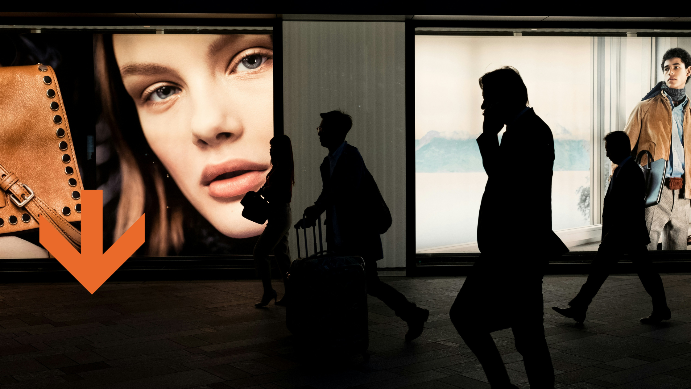
Event Signage is about more than safety and advertising. At events, signage is an integral element of the audience’s experience. From conveying an atmosphere, inspiring emotions, and celebrating someone or something specific to communicating essential information and providing directions, event signage is everywhere – and it can be a make-or-break factor for event organisers and sponsors. It’s certainly not something that should be left to the last minute!
Event signage is best deployed when integrated seamlessly into the project’s development from the beginning. As the event evolves, organisers and planners will have to consistently consider how the purpose of the event, the shared identity of the audiences, and the way they want audiences to feel can be translated into signage. On a more practical note, any information that is essential for audiences to know must be integrated into the signage strategy. This could include directions, programmes and timetables, where the bathrooms and emergency exits are, and many more besides.
There’s clearly a lot to consider, and it’s all crucial to planning a smooth and memorable event. But don’t worry, we’re here for you! We’ve put together a little summary of event signage essentials, a cheat sheet of sorts, which you can refer to if things get a little overwhelming. We’re also always here to answer any questions you might have! Don’t hesitate to reach out for advice, a quote, or a friendly chat.
Let’s dive in!

What is Event Signage?
Event signage performs specific and essential functions. Promoting your event, identifying your brand and sponsors, providing essential information, and giving directions – it does it all! It also impacts the general aesthetic and atmosphere of your event, meaning that it’s central to your success. Good event signage ensures your audience feels safe and confident about making their way around, knows what’s happening when and where, and feels part of something bigger than themselves. They might not actively notice the signs themselves, but they sure would notice their absence. It’s up to you to make sure they don’t.
The Different Types of Event Signage
To make things easier, there are distinct categories of event signage that perform specific functions. If you’ve got each category covered, chances are you’re on the right track!

Directional or Wayfinding
Directional, or wayfinding signs, are highly underrated. Despite being a little banal or mundane, wayfinding signs are perhaps the most significant strategy for guaranteeing a smooth event that audiences can actually enjoy. They’re the ones that ensure audiences know where to go! It seems simple and straightforward, but if these signs are badly designed, or straight-up missing, event attendees are likely to get frustrated and confused (especially if they can’t find the toilets or the food!).
It’s not enough for these signs to be present. They need to be placed in logical and intuitive ways that will successfully guide the flow of traffic. You’ll need to consider things like height, the design of arrows and symbols, how many signs to place where. Non-intuitive wayfinding signage is almost worse than the absence of signage.
Here’s a quick check-list of places and directions that needs signs:
- Entrances
- Registration area
- Queues
- Food, drinks, other vendors
- Toilets
- Stages
- Information points
- Mobile charging stations
- Smoking areas
- Exits (both regular and emergency)
Don’t be fooled by their practical function, though. Wayfinding signs don’t need to be boring! If you’ve got the budget, or a creative event organiser, these signs can be themed to your event so that they become an active agent in the audience experience. Every sign is an opportunity for fun, branding, and audience engagement.

Branding
Branding signs are those signs that identify who is putting on the event, and who is sponsoring the event. These signs should put the brands and names front and centre, but also generate audience engagement and create positive associations. Social media handles and hashtags are a great way to encourage the audience to engage with event organisers and sponsors on various platforms, thereby boosting exposure and promoting everyone involved. You’ll be happy, and your sponsors will be happy. That’s what counts!
Consider where you’ll place your branding signage for maximum impact and exposure, but also where audiences will have the time and leisure to engage with them.

Informational
These signs are crucial to the overall flow and organisation of the event. They make it clear what the theme, nature and purpose of the event are (a charity gala? a promotion or product launch?) so that party-goers know what to expect, and they communicate the event schedule and map. Informational signage includes timetables, programmes, and maps, as well as promotional posters.
Informational signage works in tandem with wayfinding signage. Where one tells audiences where to go when the other tells them how to get there. Make sure the terminology and labels line up! It’s no use saying that the DJ is in the Green House only to have signs for the Green Room, for example.

Safety and Security
These signs are required by law. They’re the signs that make it clear what areas are public or restricted, where the emergency exits are, and whether any particular hazards, such as fire or electricity, are present. Don’t get too creative with these signs, as they need to be easily recognisable for what they are.
Do’s and Don’ts When Designing Event Signage
Now that we’ve covered the basics, let’s jump into some do’s and don’ts of designing amazing event signage!
DO include branded imagery
Branded imagery, including your logo, your sponsor’s logos, and any graphics associated with you or the event, should be included on as many signs as possible. After all, the purpose of the event is to promote you and your sponsors! Including branded imagery means the audience are never in doubt about who is looking after them. It also helps audiences feel safe and relaxed.
DON’T overcrowd your sign
Don’t push it too far, though. Less is always more on signage, so if a sign is starting to look a little crowded it’s time to back off. Narrow down what each sign’s specific function is, so you can prioritise which graphics should take pride of place. Regarding branded imagery specifically, if it’s all smushed together and hard to decipher, there’s really no point putting it all there in the first place.
DO play with contrast
The human eye is drawn to contrast, and contrasting backgrounds and foregrounds make graphics easier to decipher and read. Don’t be afraid to go bold with your colour schemes so that people are drawn to your signs and decode them in the blink of an eye.
DON’T overcomplicate your colour scheme
Don’t go too wild though. Two or three well-chosen colours are really all you need to have a powerful and readable impact. If there are too many different colours present, the human brain is more likely to feel overwhelmed and people will gloss over your sign without reading it.
DO consider your wording
Clever words are a sure way to get people’s attention – and keep it. A witty tagline, a killer rhyme, an inside joke shared amongst party-goers, the perfect hashtag – all of these will draw people to your signs and make sure they continue engaging with them throughout the party and after. Well-chosen words end up on social media for all the best reasons.
DON’T include too much text or difficult-to-follow language
Don’t start getting too clever, however. Over-complicated language or too much text makes signs hard to interpret, and you run the risk of disconnecting from your audience. As with graphics, less is more! A short, punchy tagline will go much further than a rambling prose poem.
DO consider the fonts that best represent you
Words are an image. That means the font you choose says just as much about you and your event as the words themselves or the rest of the graphics. Use a font that feels appropriate to your brand identity, to the theme, nature, and purpose of the event, and to your sponsors. Get creative! Don’t fall into the Times New Roman trap, go your own way with a font that speaks for you.
DON’T choose complex or intricate fonts
That said, there are some fonts you should steer clear of. Anything with too many flounces and frills, or curls and swirls, will be difficult to read whether you’re up close or five feet away. As well as this, don’t go using too many different fonts on the same sign, as this runs the risk of becoming visually confusing and cluttered. As per all things design, less is more.


