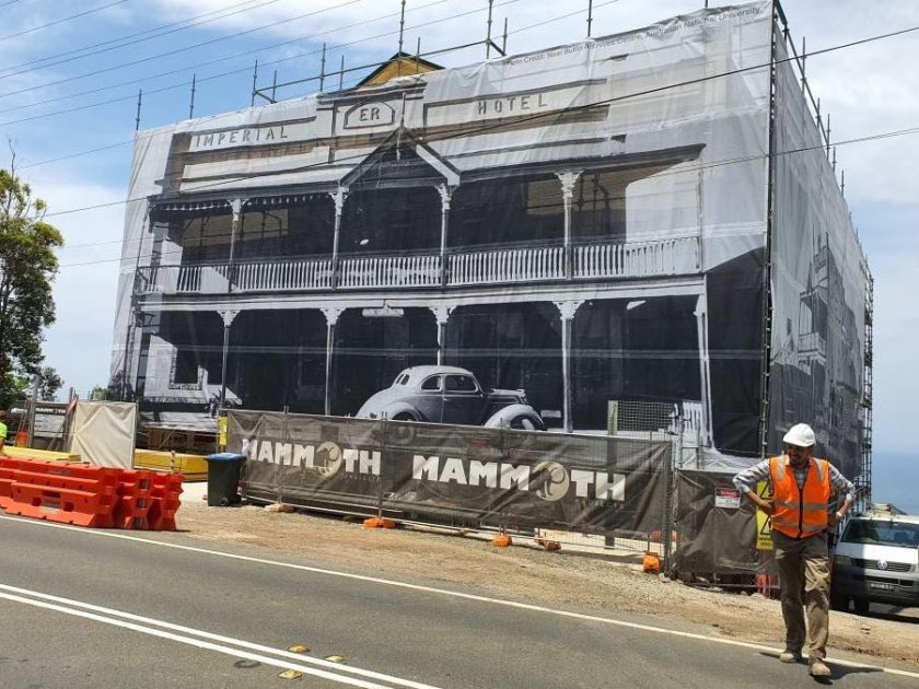
How-To: Use Contrasting Colours On Your Mesh Fencing
 04 April 2017
 4 mins read
When it comes to creating artwork for your mesh banners, we know not everyone is an artist or graphic designer. While we have an expert art department on hand at all times, we thought we’d share some insights into what makes great banner art, and how you can make your branded mesh products as eye-catching and impressive as possible.
One of the most commonly tried and tested techniques our designers themselves use is using contrasting colours. Contrast is something that should be featured on every design, no matter what it’s purpose is. Contrasting helps determine a hierarchy within the graphic, and shows the viewer which part of the image is the most important (usually the name of your brand, your logo or your website).
However, more than just making your brand name stand out, using contrasting colours within artwork creates layers of interest, and generally makes your artwork more aesthetically appealing.
So for those of you who aren’t artistically inclined, here’s a little breakdown on how you can use contrasting colours in different ways to make your brand’s mesh banner pop…
1. Use light and dark
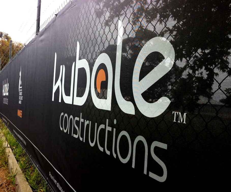
When it comes to contrasting colours, this is probably the option that most people think of first: contrasting light and dark colours. For example: white and black, light blue and dark red, light coloured text on a dark background or dark text on a light coloured background.
This is definitely one way of making your brand’s logo or message stand out, and a method that is used to great effect with mesh banners and mesh fencing.
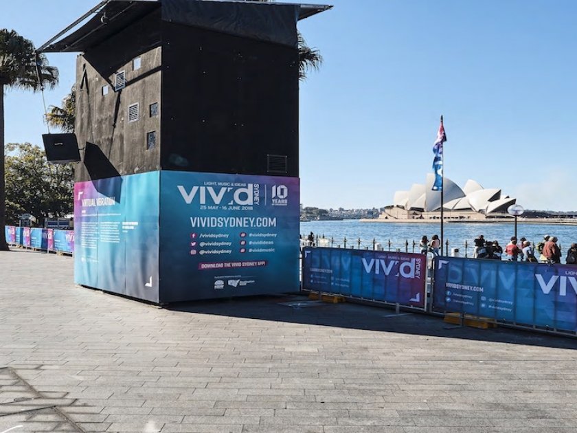
This technique helps make different aspects of your design more visible than others, and can be incredibly eye-catching, particularly in high traffic areas such as sidewalks and when featured on high rise buildings.
Our premium mesh banners have a fantastic print resolution that makes working with these types of colour contrasts incredibly simple and effective.
2. Play with temperature
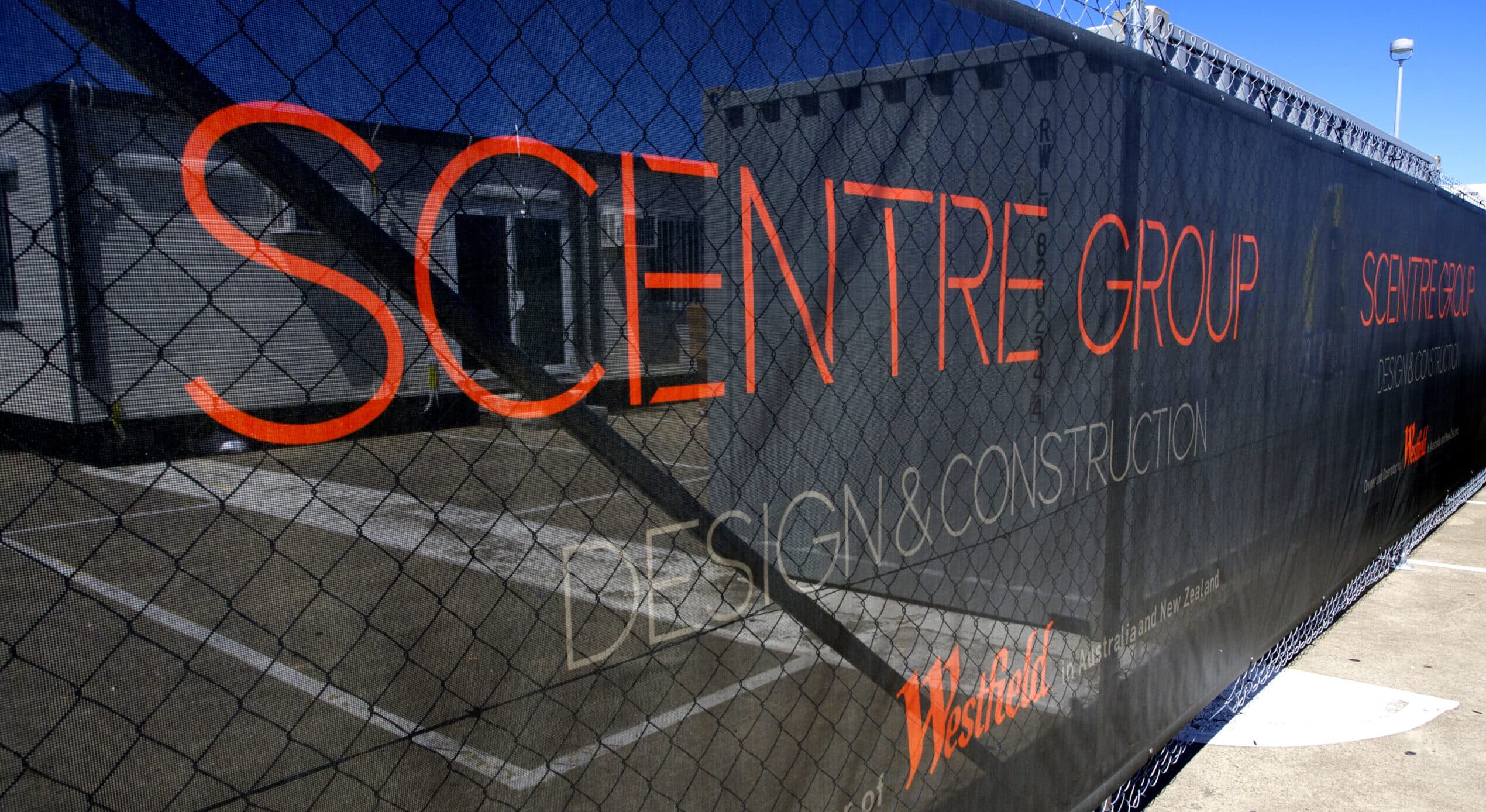
When it comes to design, all colours are separated into three different groups based on their ‘temperature’: warm, cool and neutral. It’s obvious to some, but colours like reds, yellows and oranges are on the warm side, whereas blues and greens are categorised as warm colours. Finally, white, black and grey are considered neutral.
You can contrast the intensity of the same temperatures, or alternatively, contrast with warm and cool colours. It’s completely up to you and what suits the aesthetic of your business and brand.
Playing with contrasting temperature colours is another great way to create visually appealing branding for your business. You want to utilise the advertising opportunity that banner mesh offers, and using colour in clever ways is the ideal solution to making your mesh fencing as striking as possible.
Both our premium banner mesh and our standard banner mesh options are particularly suited to printing stunning, full colour designs on.
3. Experiment with monochromatic colours
Here’s where things start to get a little technical, but don’t worry, it’s not as complicated as it sounds. Using monochromatic colours essentially just means using the same colour of varying intensities. So you might use a range of different shades of blue, or a range of different shades of red.
This is probably the least popular of the three options, as it doesn’t always have the same intensity or impact as light & dark or contrasting temperature, however it’s still a good choice to consider when questioning your brand’s aesthetic.
No matter how you choose to use contrasting colour, Mesh Direct’s in-house design team and art department can help you achieve a sleek and professional look for your branded mesh products. Whether it’s for an event or a construction site, you can rest assured that you’re in good hands.
For more information on how we can make banner mesh and mesh fencing work for you and your business, don’t hesitate to give our sales team a call on 1300 368 978.

