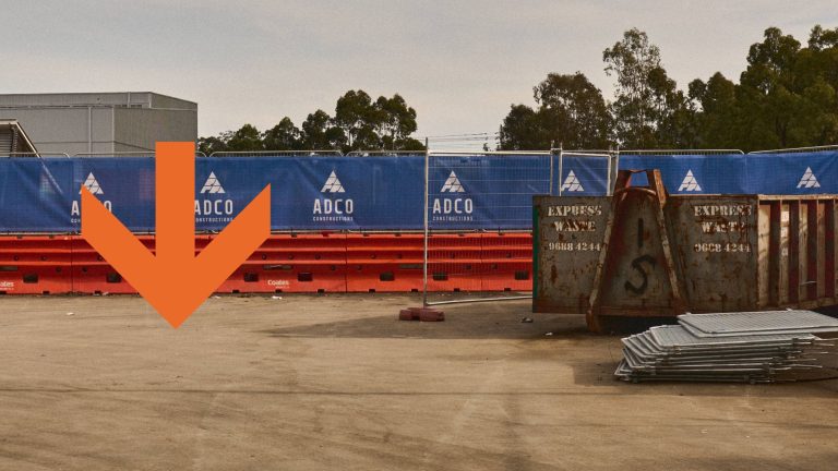
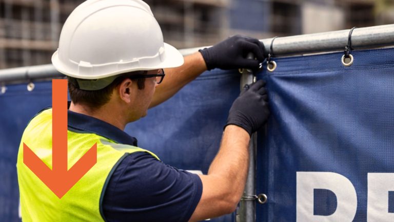
Fence Logo placement can make a significant difference in brand visibility and impact. At Mesh Direct, we understand that effective placement is key to getting the most out of your Mesh Banners. Here are some of our top tips to ensure your logo stands out and gets noticed:
Consistent Branding
Maintaining consistency in your branding is key to reinforcing brand recognition. Use the same colours, fonts, and logo placement across all your mesh banners. A cohesive and professional look helps build trust and recognition, making your brand more memorable.
Eye-Level Placement
For maximum impact, ensure that your logo and key messages are placed at eye level. This placement makes it easier for passers-by to notice and read your signage without any effort. When your message is at eye level, it naturally draws more attention and engagement from viewers.
Corners and Angles
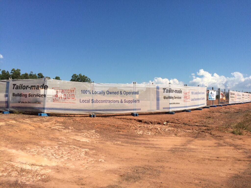
Utilising corners and angled placements can be particularly effective. These spots allow your signage to be visible from multiple directions, increasing the chances of catching the eye of anyone passing by. On construction sites, this tactic ensures that your branding is seen from various viewpoints.
High-Traffic Areas
Positioning your mesh banners in high-traffic areas is key. By placing your banners near main roads, busy intersections, or entrances and exits of construction sites, you can capture the attention of a larger audience more frequently. These spots are perfect for ensuring that your brand reaches as many people as possible.
Large, Unobstructed Spaces
Choosing large, unobstructed sections of fencing for your mesh is essential. Avoid areas where the view might be blocked by equipment, vehicles, or other site activities. Unobstructed spaces ensure that your branding remains clear and visible from a distance, making a lasting impression.
Fence Logo placement can really make or break the impact of your project. At Mesh Direct, we’re here to help you make the most of your signage with high-quality materials and expert advice. Ready to boost your brand visibility? Contact us today.


