The Power of Colour in Advertising!
 25 May 2015
 3 mins read
Did you know certain colours can ignite key emotions?
The use of colour can be associated with emotions, social status and a variety of other elements. It is important that you consider colour when you build your brand, banner or any other factors that relate to your business.
COLOUR DEFINITIONS
Colour is a visual component a person remembers about a brand or product. Gaining an understanding of colours will help you achieve an outcome of your banner or campaign. The meaning of colours and their associated moods are:
- Red is the most powerful colour and should be used in moderation. Red is associated with anger, passion, danger and love. It is known to stimulate appetite.
- Orange is commonly used as a call to action button and is associated with happiness and vitality.
- Yellow can be irritating on the to eyes as it reflects the most light compared to any other colour. Green is the easiest on the eyes. Yellow is associated with energy, optimism, sunshine and humour.
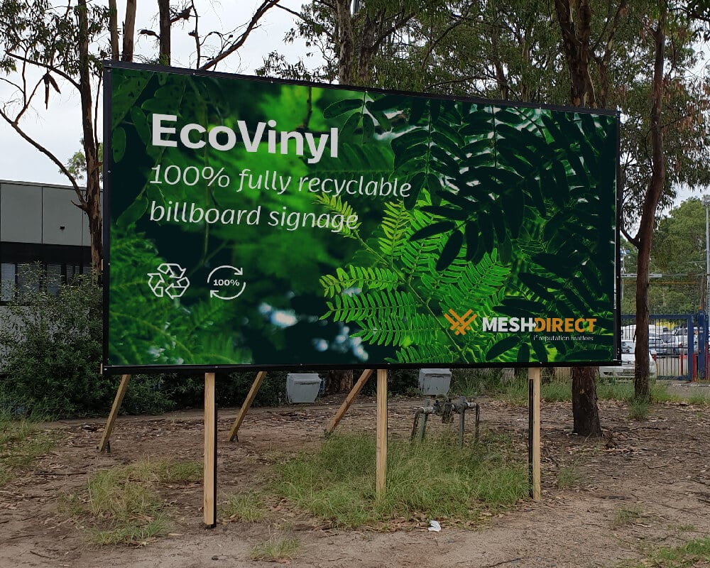
- Green is associated with growth, nurturing, freshness, the environment, wealth and new beginnings.
- Blue is associated with safety, trust, clarity, serenity, intellect, formality, elegance, truth, refreshment, coldness and masculinity.
- Purple is viewed as soothing and calming for the recipient. Purple is associated with creativity, luxury, royalty, extravagance, wisdom, magic, ambition and femininity.
- Pink portrays femininity, love, sweetness and babies.
- Black is traditional and is a readable colour particularly used on a white background. Black is associated with formality, grief, prestige, power, mystery, evil and exclusivity.
- White is associated with purity, cleanliness, modernity, sterility, simplicity, honesty, innocence, virginity and goodness.
- Brown is a great colour choice to use to balance out stronger colours. Brown is associated with nature, wood, leather and humility.
- Grey can be used to intensify other colours particularly when used as a background. Grey is associated with neutrality and practicality.
OTHER CONSIDERATIONS
Research has shown up to 90% of consumer judgments about a product are based on colour alone. Colours can even target and change consumer behaviour. For example:
- Red orange, black and royal blue attract impulse shoppers. These colours target consumers in fast food outlets, outlet shops and clearance sale venues.
- Navy blue and teal attract shoppers on a budget. These colours attract consumers in banks and larger department stores.
- Pink, sky blue and rose attract traditional buyers, particularly in clothing stores.
Research also shows that colours can affect genders differently. For example, a male’s favourite colours are blue followed by green and black. A female’s on the other hand prefer blue followed by; purple and green. Studies have found men prefer bright colours and shaded colours whereas women prefer soft colours and tint.
The choice of colours that you use influences how people see your company. Small changes in tone and hue can make all the difference between a brand which creates an aggressive reaction, to one which creates a sympathetic one. Choose your colours wisely, or better yet have a professional designer choose them for you.
PRINTING WITH COLOUR
A printing press uses 4 main colour of ink knowns as CMYK colours. C is cyan which is a blue-green color, M is magenta, a reddish pink color, Y is yellow and K is black. All printing submissions need to be submitted for 4-colour printing, meaning using the CMYK colours.
Mesh Direct has an in-house team who can assist you with your design needs. The new design service package may also be of benefit to you.

