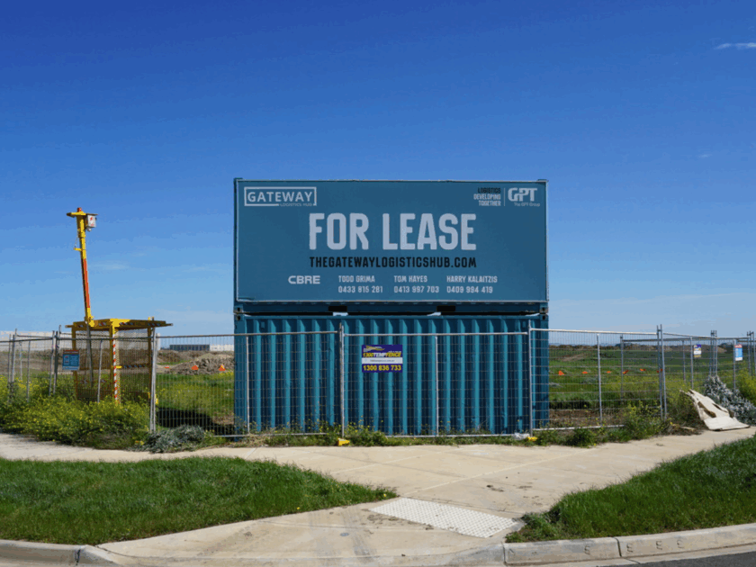
Increase Branding: Use Custom Printed Signage on Your Construction Site
 16 July 2020
 4 mins read
Every construction site needs signage: entrance signs, safety signs, wayfinding signs, hoardings. All of these and more are essential elements in the organisation, security and aesthetic considerations that accompany a building project. Financial, labour and time resources need to be allocated to them before any work can actually begin. This is were custom printed signage comes in handy.
It might feel like signage is, at best, a necessary hoop to jump through or, at worse, a money-pit with no returns, but this impression couldn’t be more wrong. There’s a straightforward and simple way you can transform the practical need for signage into a fantastic opportunity to promote your brand: custom signage.
With custom printed signage within and around the site, your brand and, therefore, your company, take centre stage. From the hoarding to the safety signs, every element of your site can work to transform one project into an advertising campaign. This is why it’s so important to customise your signage effectively and make the most of every opportunity to put yourself out there.
Branding a Construction Site
As we’ve mentioned already, construction sites are awash with signage. That means they’re awash with opportunities for branding! How can you go about creating your brand and expressing it across your site? Read on for a few tips.
Designing Your Identity
Your identity as a company can be expressed using a variety of tools. They come together to create your brand.
Colour Scheme
Colour psychology is a critical element in designing a colour scheme. How do people react to specific colours? What emotions, qualities or attributes are associated with particular colours? Most importantly, what qualities and feelings do you want people to associate with you?
Once you’ve picked out a few colours, narrow it down even further. Your scheme shouldn’t be too busy, and we recommend choosing no more than two or three colours. Use them across all of your signage for consistency and coherence.
Typeface
The fonts that you use communicate a lot about your corporate personality. A modern font expresses a different type of company than a retro or futuristic font! As long as they’re easily legible, choose the ones that will resonate most with your target audience. Again, we recommend combining no more than two or three fonts.
Tagline
This is the short (no more than six words, ideally!) message that the general public will come to associate with your company. It should be clear and emotive, telling us in no uncertain terms who you are as a brand. Think of Nike’s ‘Just Do It,’ Apple’s ‘Think Different‘ or Coca-Cola’s ‘Open Happiness.’ These iconic brands have developed loyal followings based on their strong identity expression.
Logo
This graphic element features on everything from signs to business cards, stationery and correspondence. Unlike essential information or your company name, your logo doesn’t necessarily need to be legible as such, it needs to be recognisable and unique so that the public associates it with your brand. If you use it consistently, people will be able to rattle off your name, service, and maybe even email address after only seeing your logo.
Expressing your Identity
Every single sign on your construction site is an opportunity to express your identity, thereby helping staff, visitors, and passers-by alike remember you in their time of need. So kind of you.
Entrance, Safety and Wayfinding Signs
This signage is generally smaller and more compact than customised hoarding, banners or fences. While you might not include your tagline, customising this signage to feature your colour scheme, typeface or logo is a great way to build coherence across the site and subtly reinforce your branding.
Hoarding, Banners and Fences
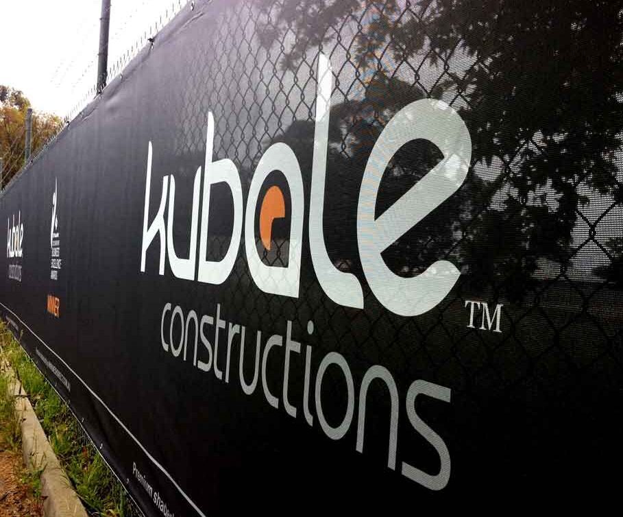
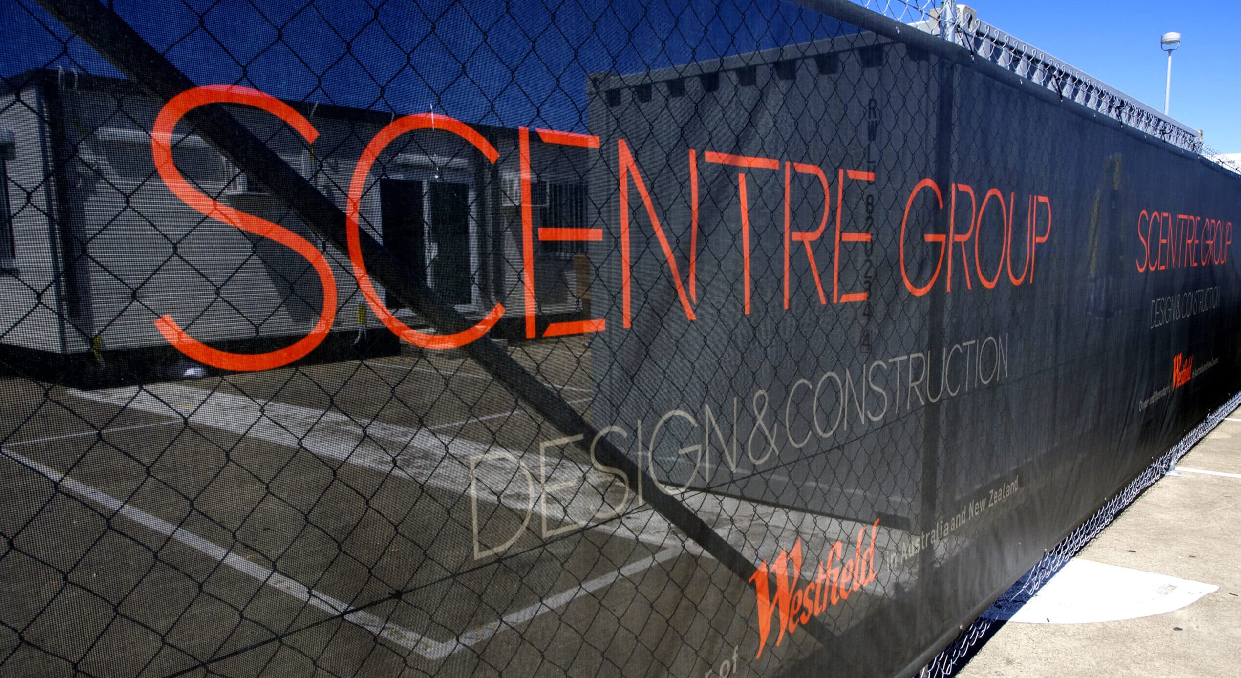
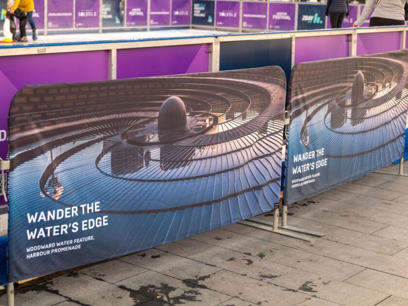
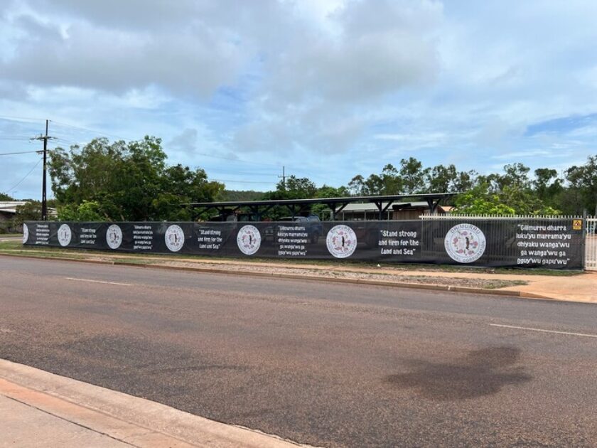
We’re playing with the big boys now! Great products such as custom printed banner mesh, shade cloth, vinyl and many more can be used across your site to display your branding. Visible from afar, this type of signage embellishes a site, catches the eye of thousands of passers-by and builds a positive relationship with the public.
Featuring your colour and typeface schemes, your logo and your tagline, these custom printed signs are a great ally when it comes to brand exposure. They’re your 24/7 salesperson who silently speaks a thousand words. They help fix your brand into the public consciousness. Really, there’s very little that they can’t do.
With custom printed signage, every project is the perfect brand exposure opportunity.
Contact us to find out more about our custom printed signage and see projects we have been involved in here.

