Three Design Tips for Creating Signage that Stands Out
 22 May 2019
 2 mins read
We live in a fast-paced digital world. It seems to become increasingly challenging to be heard over the noise of competitors. However, when it comes to grabbing people’s attention, sometimes a good old-fashioned sign can be a great choice. Especially if you already have the space to display it. So it’s important to make sure your sign stands out. We’ve put together some of the best tips for creating signage that stands out below.
1. Colour
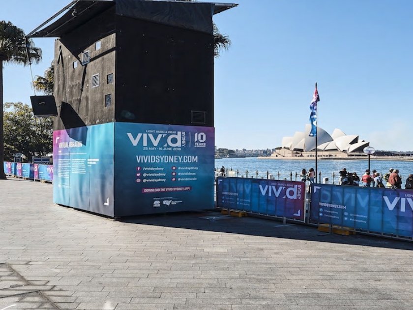
The choice of colour plays an important part in grabbing people’s attention. Think of examples such as “Coke red” or “McDonalds yellow”.
Another consideration might be trendy colours. Some business might do well by conveying brand personality through current colours.
However, if you already have a company logo and branding which you are using on your signage, it is important these colours work together.
2. Contrast
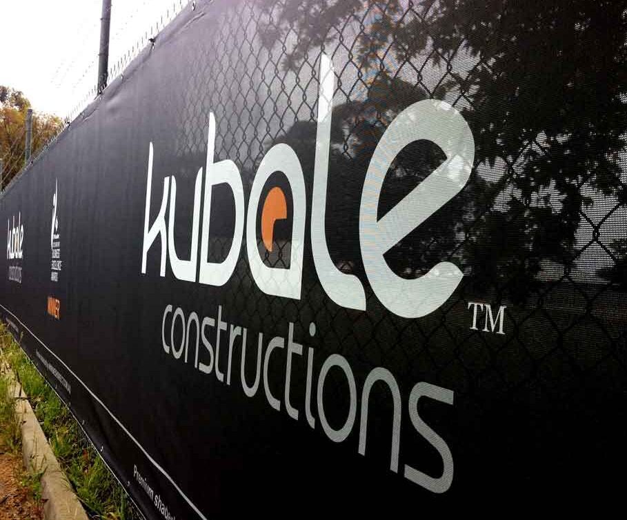
The contrast on your sign will affect the readability and overall effectiveness of your messaging. Take a step back and think whether these colours will work together once printed on a 10-metre banner.
Most signs will include either text or graphics in the foreground and a continuous colour in the background. The contrast of the foreground and the background are crucial to the viewer’s attention and understanding.
It seems obvious, but it’s a mistake you don’t want to make.
3. Size Matters
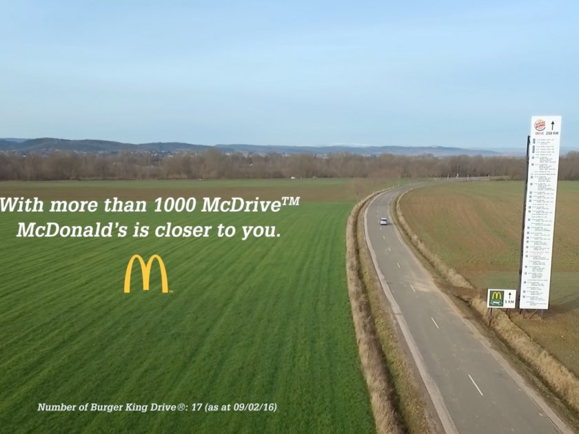
It’s true, size really does matter. Put simply, the larger the letter, the easier it is to read. This is especially important if you are creating roadside signage or signs that will be displayed at a significant distance from viewers.
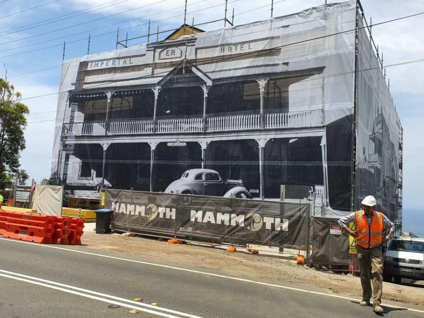
And let’s be honest, the bigger the sign the more likely people are to notice it and look at it.
Still need help?
At Mesh Direct we have a number of services including our own in-house graphic design team. If you still more help with how to create signage that stands out, we are here to help.
Get a quote today by clicking here.


